Superior Marketing specializes in direct mail advertising for chiropractic and integrated medical clinics. This logo redesign was done in 2019 and the individual items represent their business cards, media kit, a slide to be used during trade shows and their website home page.
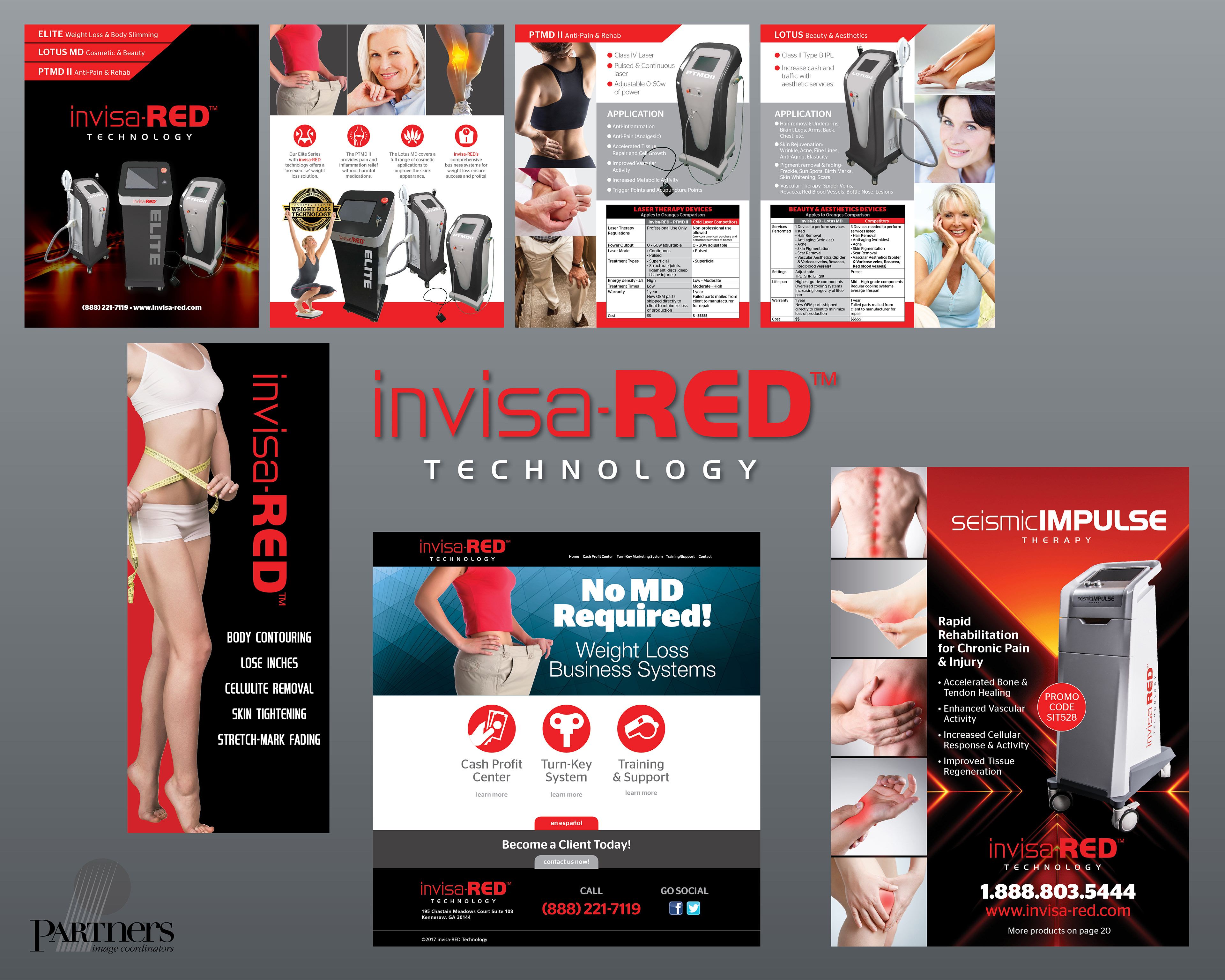
Invisa-Red's needs were quite different. Not only did they require a logo, but they also had Partners design the look of their equipment, shape, color and logo placement. Above is their home page, a one-sheet, their catalog and a trade show banner. Although the logo may appear to be a standard typeface, it actually has altered letters so it cannot just be typed.
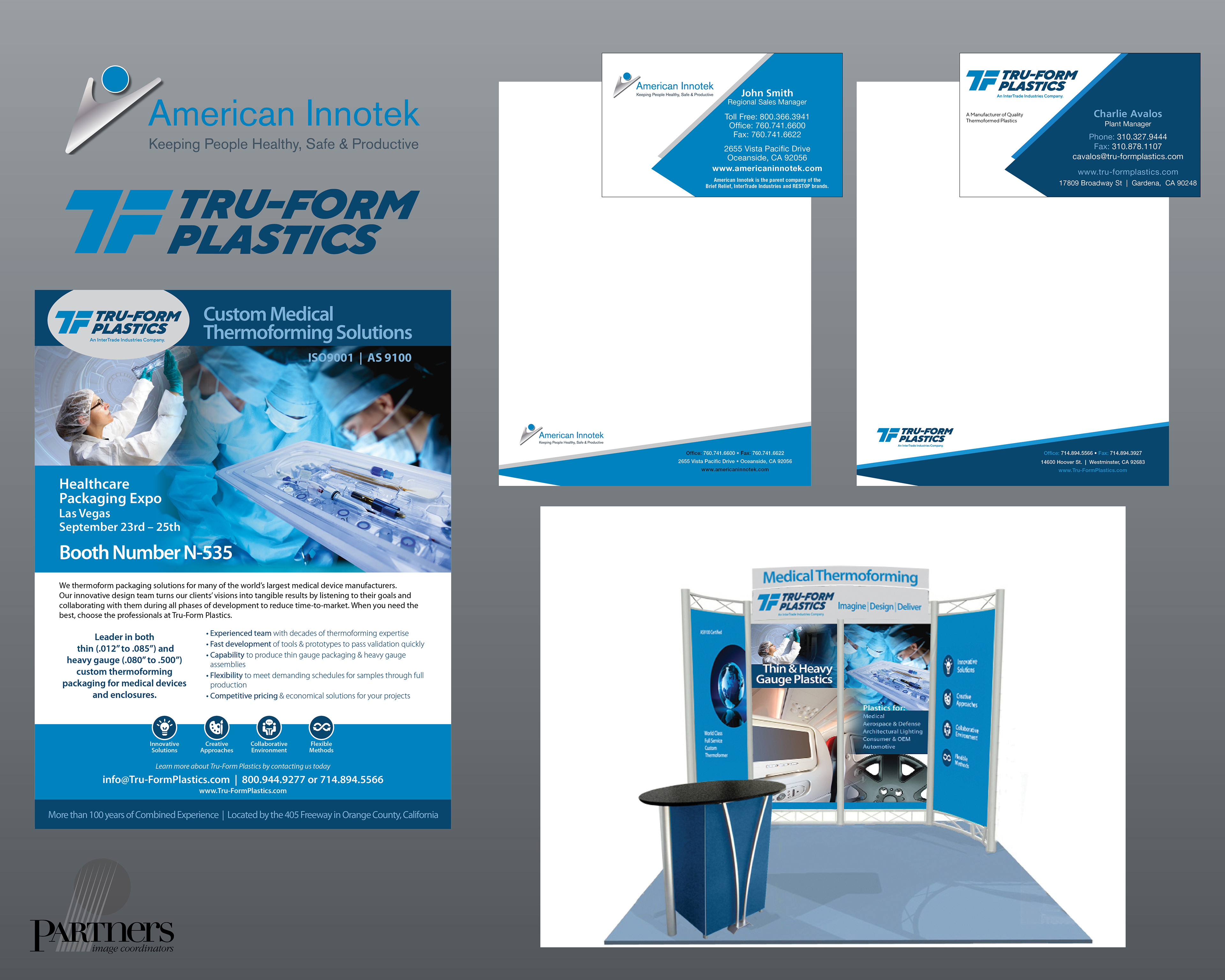
American Innotek is the parent company of Tru-Form Plastics, for which Partners developed logos. Note that they share the same business card/letterhead design using their respective colors. The other graphics represent their trade show display and an ad for their booth.

True North Chiropractic had quite the list of things their logo should convey. They requested their initials, a christian symbol and the north star. This very simple mark actually captures all of these elements in a very subtle way.
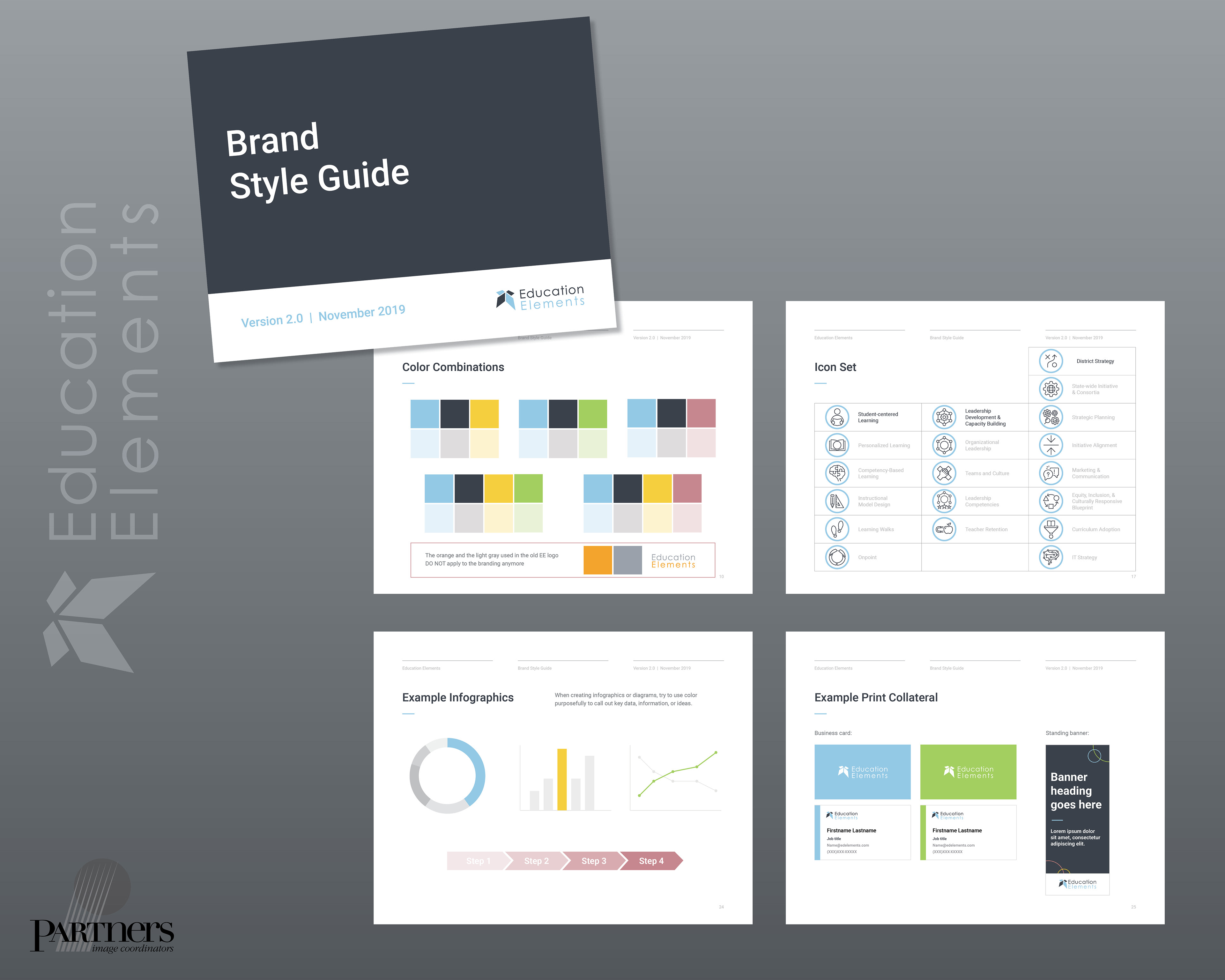
Sometimes you're asked to pick up where others have left off. That was the case on this Education Elements Branding Guide. These are some the the pages that were edited or created in addition to the existing book.
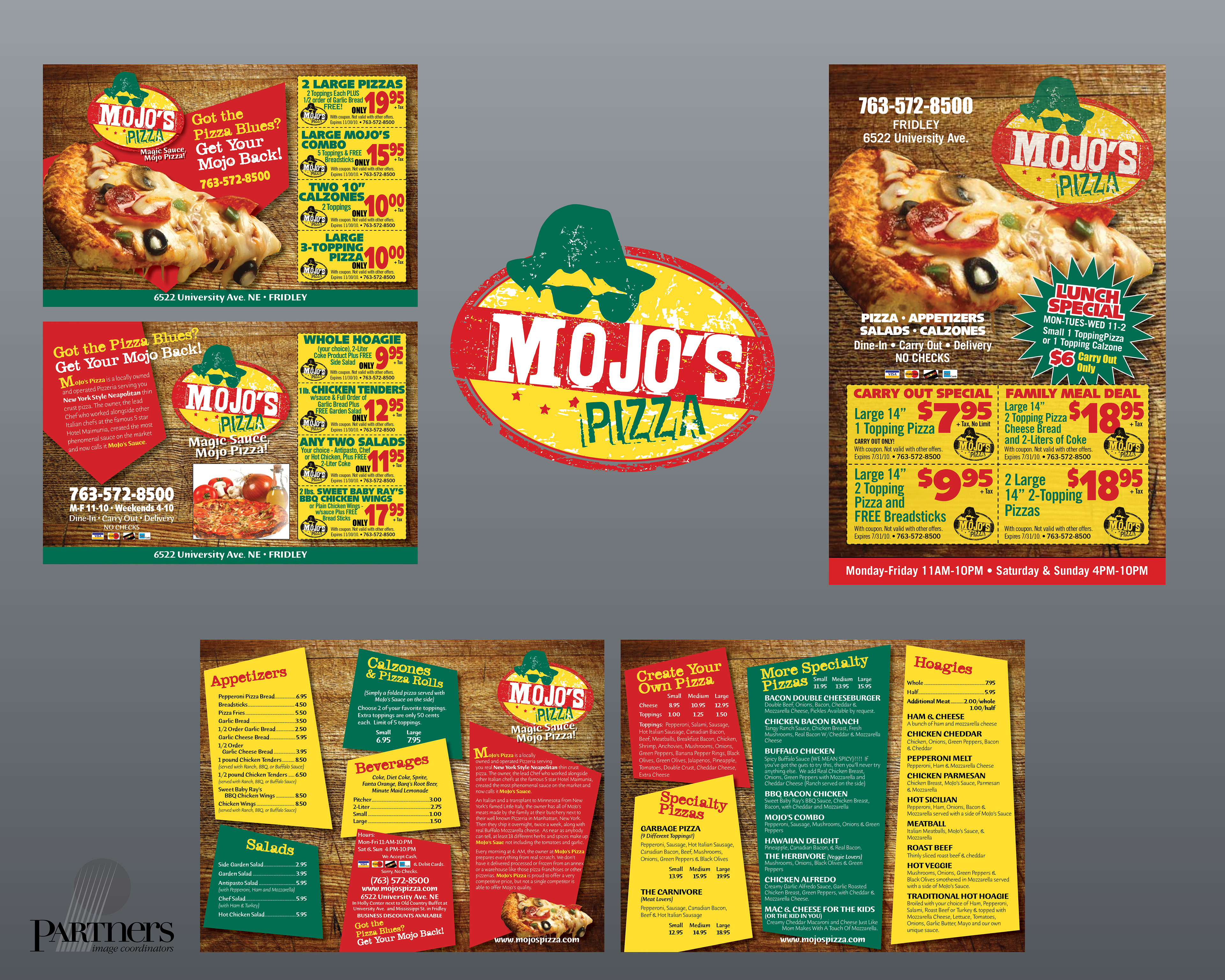
It's an oldie, but goodie with this 15-year old branding for a singular pizza place. The branding fit their decor and request for a "Blues Brothers" vibe.

When only rough guidelines are provided, clients are often pleasantly surprised when they receive something that reflects their business in the first round. These just required a little tweaking to refine them.

Logos are a very personal thing. Even though some of these would not have been my choice, they reflect the client's view and a happy client is a worthy goal.